Vibrant Sky Workshop

Big Sky
16x16 oil on panel
In this fun and quick-paced course, students explore techniques used to create expressive paintings with a palette knife. Working with a palette knife to create a broad range of textures, students learn the nuances of value, working wet in wet and layering in order to keep colors rich and vibrant. There will be an emphasis on color mixing and keeping you colors clean (no muddy colors) This course will begin with a demo to cover the basic approach. Demonstrations will continue as well as working one on one with the students as you work on your paintings. All levels welcome, including beginners. The class will be taught using oils. Make sure to bring a sack
lunch and any snack and drinks that you need. There are no close by restaurants.
Min. 4, max. 14.
Sat Feb 28 10:00 - 3:00
Callanwolde Art Center
Atlanta GA
Supply list below
120.00
Follow the restoration link and scroll down until you see class code PAD121 Palette knife workshop: vibrant sky.
Let me know if you have any questions
Hope to see you there
Supply List Vibrant Sky Workshop
Bring what you have but this is what you need for class.
I prefer working in oils because my mixture will stay wet for the class. Acrylic will dry quickly so you will need to keep them wet with water or a retarder.
Here is a list of suggested colors. But bring what you have. I like to have cool or neutral yellow, a warm blue, and a cool red and blue. Sap Green, Yellow Ochre, and Burnt Sienna are just great to mix with.
** See more about pigment codes below*
- Pick a cool red - Alizarin Crimson Pigment code PR83, or Permanent Rose Pigment code PV19 (primary).
- Pick a warm red - Such as a Naphthol Red pigment code PR170, a Cadmium Red or hue - (either the light of the medium), the Cad light, PR108, will be more orange and the Cad Med, also PR108, will be more scarlett. An orange such as Cad Orange will work as well
- Pick a cool or neutral Yellow - *Cadmium Yellow Light, PY 35 or PY3, or Cadmium Lemon PY 35 (primary), or Hansa Yellow PY 74
- Pick a cool blue - Phthalo Blue, Phthalo Blue Green Shade PB 15 (primary), Cerulean Blue Chromium PB36. Prussia Blue, Manganese Blue – Just fine
- Pick a warm blue - Ultramarine Blue PB29 , or Cobalt Blue PB 28
- Titanium white 5OZ Tube (Opaque wihte)
- Yellow Ochre PY 42, or Yellow Oxide, either will be fine will be fine. (Great for Mixing)
- Sap green or any warm green (mixture & gray for mixing)
Optional colors to add later
Naphthol Red/ Cadmium Red or hue / an orange (Warm Red)
Dioxide Purple
(Combo of the red and blue primaries - great for mixing)
Burnt Sienna (Great for Mixing)
- 9 x 12, 12 x 12,12 x 16 or panel or larger (panels work better for palette knife, but canvas is fine for all other classes) Bring extra panels or canvas pad for practice
- Acrylic and oil disposable Palette Pad 9 x12 . You can use a roll wax paper
- Palette knives plastic or metal - The plastic 5 pack at Binders is great for beginners
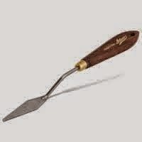
***If just buying one get Utrecht 1003 or one similar to the image below
Paint thinner to help base coat your canvas. Turpenoid or liquid for oils - water for acrylics
- Sketch pad
- Pencil
- Roll of paper towels
This is the end of the supply list - the rest is just useful info
If using oils you may want LIQUIN IMPASTO or Solvent
to extend the paint
If using acrylics you will need a
slow drying medium
or
retarder
and spray bottle for water to help slow the dry time.
* All have the same code PY35. Make sure to open the tube on Cad yellow light, Lemon and some times Cad Yellow Medium and check to see it doesn't have an orange tint. Same name and pigment code Cad Yellow - but some are neutral and some have too much red. Cad Lemon should be the coolest. You can always add red, but you can’t take it out**
**Where do you find the pigment codes and what does it tell me?


Manufacturers are free to give their art supply colors whatever name they deem appropriate. Different manufacturers give different names to the same color, even if the same pigments are used. Therefore, names may vary from one brand to another. I tend to buy single pigments except for color that I mix all the time. If love a mixture that I don’t want to buy, often the codes on the back will tell me how to mix it myself. Also, I like working with a lot of transparent colors. You can always add a touch of white to make them opaque.
Alizarin Crimson PR: 83 (single pigment)
PR: 83 – The first letter Identifies whether a pigment or a dye is used. Here the P indicates that a pigment is used.
PR: 83 – The second letter identifies the pigment code. Here, the pigment code stands for red.
PR: 83 – The number indicates the specific pigment number.
Sap Green PG7, PY75, PBk9 (mixture of three pigments)
***If just buying one, pick one of these

This is a good
variety to started
