Call to Painters
Where: Duluth, GA
Event Dates: May 6-8
Application Deadline: May 5, 2016
Event website: www.paintduluth.com
Artist Amenities:
- Total cash awards of $1,500
- Housing available Thursday, Friday and Saturday, with local art patrons
- Plein Air Seminar offered on Thursday, May 5 for $150
- Reception Sunday evening, 6pm - 9pm to the general public
- Discount coupons from local restaurants and merchants
- Maps, water, snacks
- Art dinner, Saturday evening ($10 per artist)
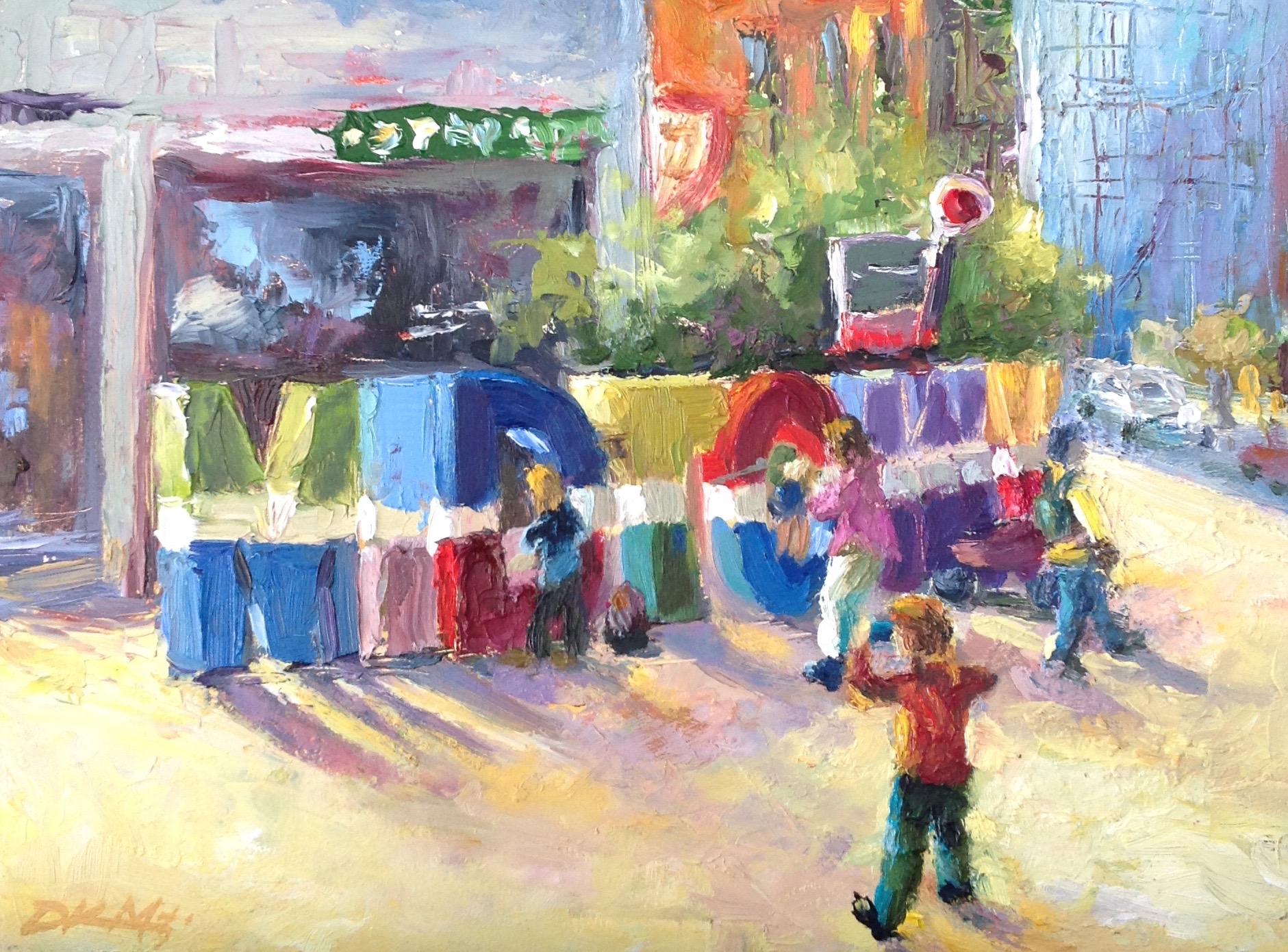
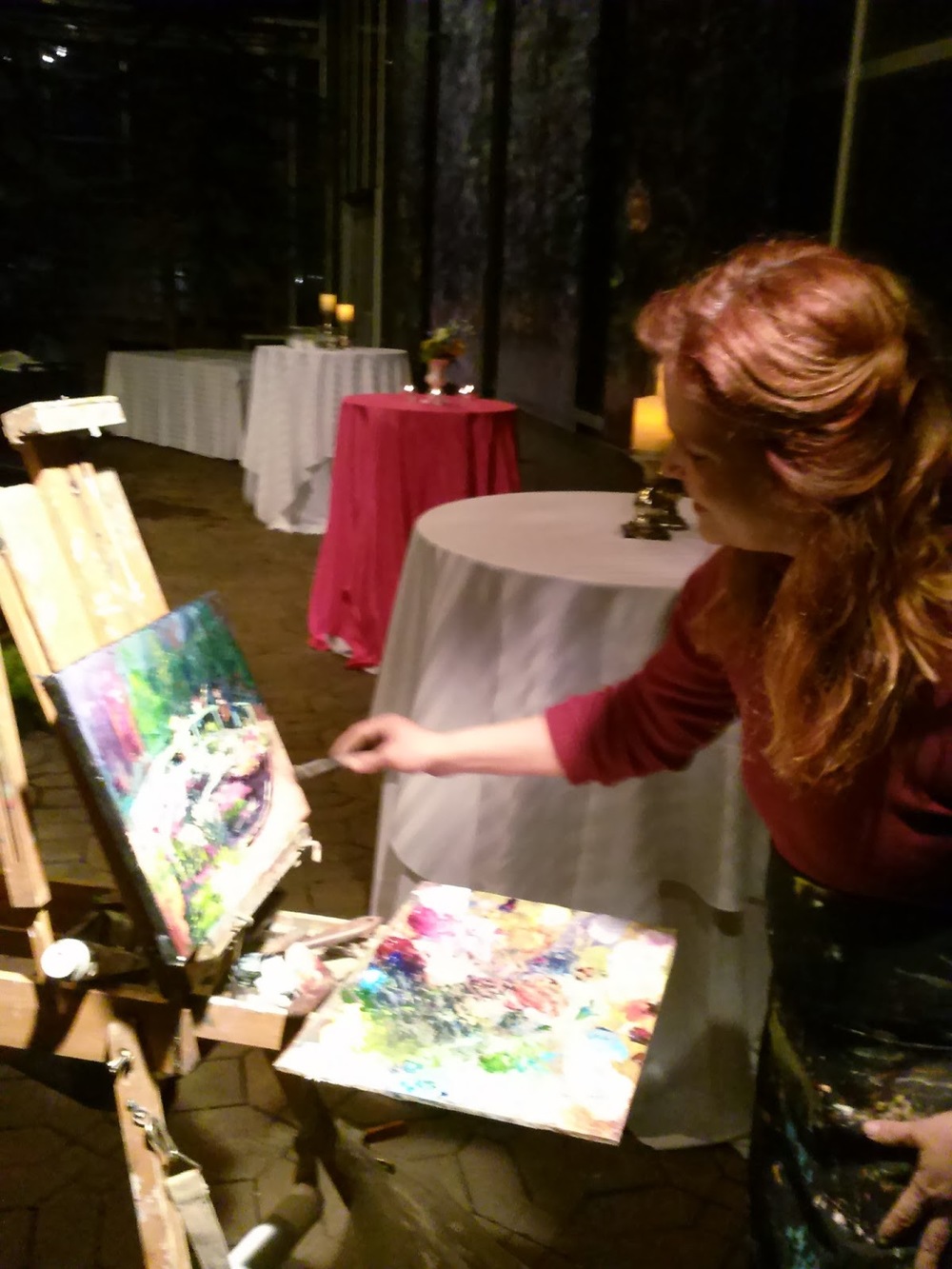
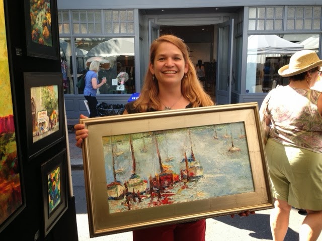
Paint Duluth is a plein air adventure in its inaugural year. The event will be held in beautiful Duluth, GA, Friday, May 6 - Sunday, May 8. Painting will be limited to the city limits of Duluth, GA. An optional plein air seminar is offered Thursday, May 5.
Established in 1868, Duluth is a cozy northeastern suburb of Atlanta, located just 35 minutes northeast from downtown Atlanta. Duluth is a southern gem with a growing focus on the arts.
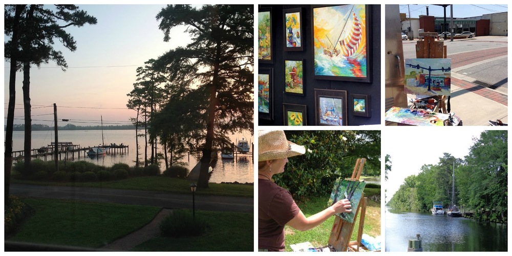
The Duluth area will give artists the opportunity to paint:
- Beautiful old southern homes
- The historic downtown area of Duluth
- The Duluth City Hall and town green
- Southeastern Railway Museum features 90 items of rolling stock, including historic Pullman cars and classic steam locomotives
- A historic railroad station
- The Chattahoochee river with tubers, rafters and fly-fishermen
- Nearby farms with cattle, hay bales and old barns
The event is being hosted by the Duluth Public Art Master Plan (DPAC). All monies will help support the Public Art Master Plan and scholarships for Duluth students hoping to continue their higher education in the arts.
Entry Fee: $30
Apply now: www.paintduluth.com/application-form/
Visit: www.paintduluth.com for complete event details