Beginning Painting Supply List

Supply List Palette Knife Workshop / Beginning Painting

For questions  email dawn@dawnart.com

Bring what you have but this is what you need for class. 

I prefer working in oils because my mixture will stay wet for the class. Acrylic will  dry quickly  so you will need to keep them wet with water or a retarder.

Here is a list of suggested colors. But bring what you have. I like to have cool or neutral yellow, a warm blue, and a cool red and blue. Sap Green, Yellow Ochre, and Burnt Sienna are just great to mix with. 

** See more about pigment codes below*

  • Pick a cool Red - Alizarin Crimson Pigment code PR83, or Permanent Rose Pigment code PV19 (primary).

  • Pick a cool or neutral Yellow - *Cadmium Yellow Light, PY 35 or PY3, or Hansa Yellow Light PY 74 ( I use Hansa Yellow Light from Utrecht ) * Most Cad yellows have the same code PY35. Make sure to open the tube and check to see it doesn't have an orange tint. Same name and pigment code Cad Yellow - but some are neutral and some have too much red. You can always add red, but you can’t take it out*

  • Pick a Cool Blue - My favorite is Phthalo Blue Green Shade PB 15 (primary), Cerulean Blue Chromium PB36. Prussia Blue, Manganese Blue – Just fine

  • Titanium white 5OZ Tube(Opaque wihte)

  • Yellow Ochre PY 42, or Yellow Oxide, either will be fine will be fine. (Great for Mixing)

  • Sap green or any warm green (mixture & great for mixing)

Optional colors to add later  Naphthol Red or Cadmium Red or hue,  Dioxide Purple  - great for mixing

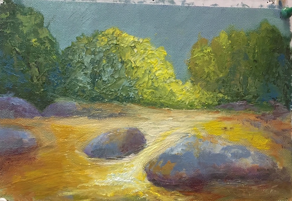
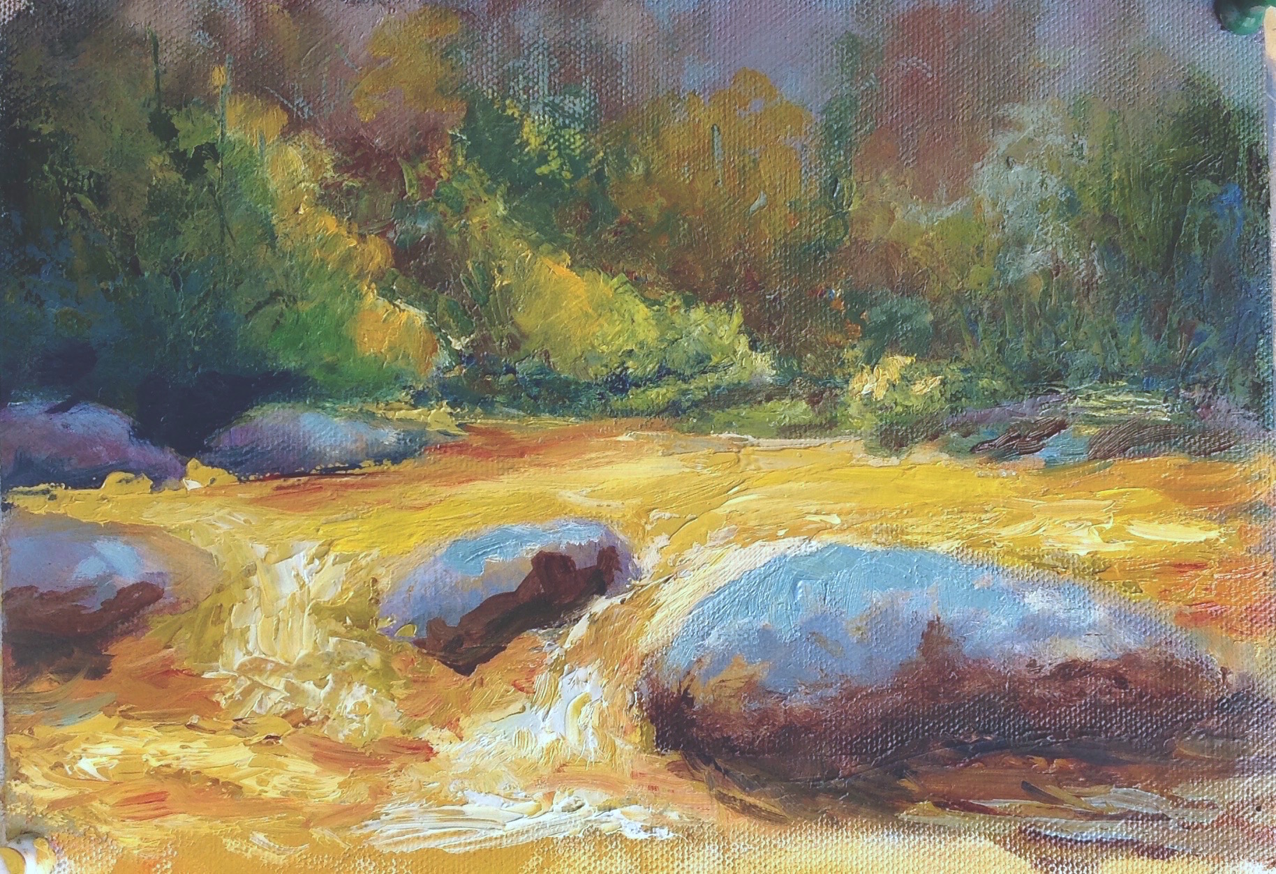
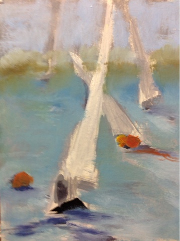
  • Beginning brush kit with a mix of bristle and soft brushes is an easy start. I have a photo below.

  • 9 x 12, 12 x 12, 12 x 16 Canvases or panels or larger (panels work better for palette knife, but canvas is fine for all other classes) Bring extra panels or canvas pad for practice

  • Acrylic and oil disposable Palette Pad 16x20 . You can use a roll wax paper

  • Paint medium to help base coat your canvas and block in color. I use Gamblin Solvent Free Liquid or Gel. You can use other brands.

  • Solvent to clean burshes. I prefer Archival Odorless Solvent as it has no smell that I can tell. You can use Gamsol or turpinoid as well.

  • A sealed container for cleaning brushes. I use a Silicoil Jar. Or you can make your own. Click on the link for examples

  • Sketch pad

  • Pencil

  • Roll of paper towels

  • Palette knives plastic or metal- the plastic 5 pack at Binders is great for beginners ***If just buying one similar to the image below

  • For iPhone and iPad users, here my favorite app Accuview https://itunes.apple.com/us/app/accuview/id407578464?mt=8

**Where do you find the pigment codes and what does it tell me? 

Manufacturers are free to give their art supply colors whatever name they deem appropriate. Different manufacturers give different names to the same color, even if the same  pigments are used. Therefore, names may vary from one brand to another.I tend to buy single pigments except for color that I mix all the time. If love a mixture that I don’t want to buy, often the codes on the back will tell me how to mix it myself. Also, I like working with a lot of transparent colors. You can always add a touch of white to make them opaque.

Alizarin Crimson PR: 83 (single pigment)

  • PR: 83 – The first letter Identifies whether a pigment or a dye is used. Here the P indicates that a pigment is used.

  • PR: 83 – The second letter identifies the pigment code. Here, the pigment code stands for red.

  • PR: 83 – The number indicates the specific pigment number.

Sap Green PG7, PY75, PBk9 (mixture of three pigments)

I hope this help you get started and get in touch with any questions 

Get the most out of your paintings

Techniques class 1 Recap

By taking the time to work out your design and values before hitting the canvas can make the experience more enjoyable and result in a better painting. If you haven't decided where you are going with the painting or what are the most important elements, you can spend most of your painting time trying to work through all that and it will show.

Here is a recap of what we covered in class today. Working from a photo, create as many gesture sketches as needed until you are happy with the design. These need to be fast and are meant to help you work through your ideas about the composition. Make as many adjustments as you need. Next step, create a value painting using black, gray, and, white. By taking away the color in a study, it's much easier to see what is going on in the painting. Again, make any adjustments to make a stronger painting.

In this example, I am working from several different photos.

Below are my initial gesture sketches.  The wagon is the focal point and the house is just the back drop. But in my first sketch the wagon is a minor player. I switched to oil pastel and tried agin. It wasn't until the 4th one, I came up with something I liked. I finally made the wagon the major part of the painting. I was able to work through this in about 30 mins. That's the beauty of a rough drawing, just keep tossing them out until you get a good one.

Gesture sketches for wagon painting

Next week  - block in the painting with color. 

I often will do this step in acrylic so that I can make quick adjustments before starting with the oils. When you"re happy with the overall design and color palette,  it's time to paint!

Blocking in color for wagon painting

All of this took under and hour, and the time and struggle it will save for the rest of the painting will be well worth it. 

We will work on blocking in the color in next weeks class.

Second week making color notes.

Below you can see  the next steps. Making color and value decisions. 

Until then - have a great week!

Dawn

Hope to see you out there.

Happy fall, Dawn

Making Successful Grays by Michael Chesley Johnson

I follow Michael Chesley Johnson's blog and saw this the other day. I thought he had some good ideas about mixing grays and wanted to share them.  I hope you find this as interesting as I did. 

You can check out his work at http://www.michaelchesleyjohnson.com

"Morning at Raccoon Beach" 5x7, oil 

"Morning at Raccoon Beach" 5x7, oil 

Greys are both easy and difficult to conjure up.  Easy, because there's nothing like a dirty brush to work its black magic in creating rather ugly greys.  Difficult, because a pretty grey takes a certain amount of apprenticeship in mixing color.

First, let's make sure we've got reasonably clean brushes.  That will keep you from summoning grey without meaning to.  Now, let's think about how greys are made.

They say you can make a grey by mixing a color with its complement.  This is true, but it can be a very muddy grey.  A prettier grey can be made by mixing a color with its near-complement instead.  This is because the grey is closer in character to the color being greyed.  Try it.  Use a color wheel to help you identify the near-complement.    If you want to grey down a green, don't use red - instead, use red-violet or red-orange.

Let's take this a step farther.  Look at the color you want to grey and decide if it is a cool or warm version of its base color.  To grey it, add the same temperature of its complement.  If it's a cool red, use a cool green.  If you use a warm green with a cool red, this will make mud.  Using a cool with a cool will make a more beautiful grey.  As an example, I paint a lot of fog, and many times I'll start off with a light pink - that's cadmium red light with lots of white, and very cool - and then scumble on a light cool green, such as viridian with lots of white.  This combination gives me a mudless fog.

In the little 5x7 sketch above, I use this approach, but for a sunny scene.  The scene had a lot of grey in it.  I painted all the major shapes with the complement of the correct value and correct color temperature, and then overlaid them with the local color.

(First posted June 15, 2011)

--- Michael Chesley Johnson, AIS PSA MPAC PSNM www.MichaelChesleyJohnson.com


Paint on my friends,
Dawn


Looking Forward to Spring

This time of the year, it's super easy to yearn for spring blooms and sunny days. I know it's just around the corner!!

Here is today's palette knife demo for my Wed Morning Techniques Class.

"Looking Forward to Spring" 12x12 oil on panel

You can check up upcoming classes below. We wrapped up the Wed class today, but I'll start back March 30th. Check it out and join us if you can. Class size limited to 6.

Happy painting,

Dawn